Pharma Plus
Web design.UI/UX.Design System
A overhaul site design that boost a healthcare company
Year:
2026
Timeframe:
8 months
Tools:
Figma. Colorbox. Figjam. Notion. Storybook
Category:


PharmaPlus is an independent-pharmacy group from the USA built on 20 years of local trust, seeking to expand their offering by transitioning to digital solutions. I worked with them from end-to-end as a solo product designer, and helped them to translate their counter-led business into a responsive and usable website with clear services journey and a lightweight design system. In this project I showcase at a glance part of the deliverables and behind-the-scenes during the design process.
Challenge
The existing site was a brochure built in 2000: a four-link page, not optimised for mobile screen and navigation constraints. Every service started with a phone call to a branch team already serving customers face-to-face. Three main constraints shaped the project. The audience skews older and less confident digitally, so accessibility was a business requirement rather than a checkbox. Branding was async across signage, print and digital so many inconsistencies were found. And with a not dedicated design team other than me, anything I delivered had to be simple enough to survive for handover.
Solution
I started by mapping what the business actually sells, understanding their service offering and architecting a site map to start defining the website structure. In tandem with product manager and stakeholders we clearly define all the services journeys - the what it is, who it is for, what is like, how long it takes. Sixteen services were merge and buried, content and design audit were run across all the ecosystem, tree-maps, wireframes and usability and surveys tests were essential to define what it would be the final product. From there I built the interface from the bottom-up, scalable and user friendly component libraries that respond to user’s needs and colour and type variables compliant to WCAG 2.2 AA Accessibility standards. The final piece was a compact component library — twenty-four components, documented in Figma and mapped one-to-one to the developer's front-end. Small enough to learn in an afternoon, structured enough to build the product’s pages.
Results
The site launched in Feb 2026, online medical prescriptions requests grew steadily through the first quarter, and branch teams reported a noticeable drop in routine phone calls. Optimised processes, robust online presence and time that went back to the counter were part of the great achievement that Pharma Plus got from the project.
"The new site moved 45% of medical prescription requests online within three months, while reducing routine branch phone calls by roughly a third." - Emily Heights , Product & Pharmacist Manager
Design deliverables
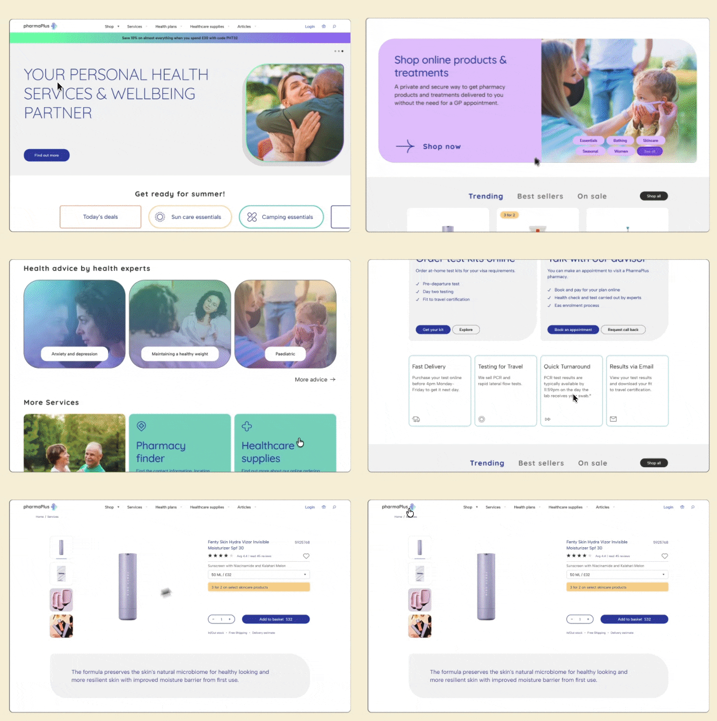
Snapshot of assets delivered across the whole project


Vital stats
Figures that show the value of going digital
+45%
Repeat prescriptions requested online
03
Steps service booking, down from seven
AA
WCAG 2.2 compliance across all templates
98%
User satisfaction according to NPS and CES scores


